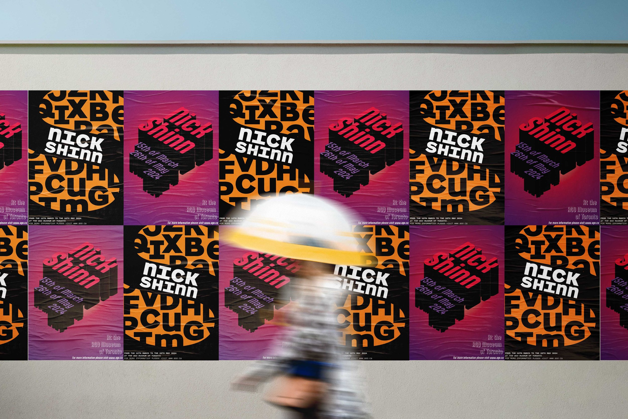
This project presents two posters celebrating the work of typographer Nick Shinn, focusing on his innovative typefaces Parity Sans Mono and Aptly. The exhibition highlights his contributions to modern typography through bold design choices that bring attention to the unique characteristics of each typeface, creating a dynamic visual experience.
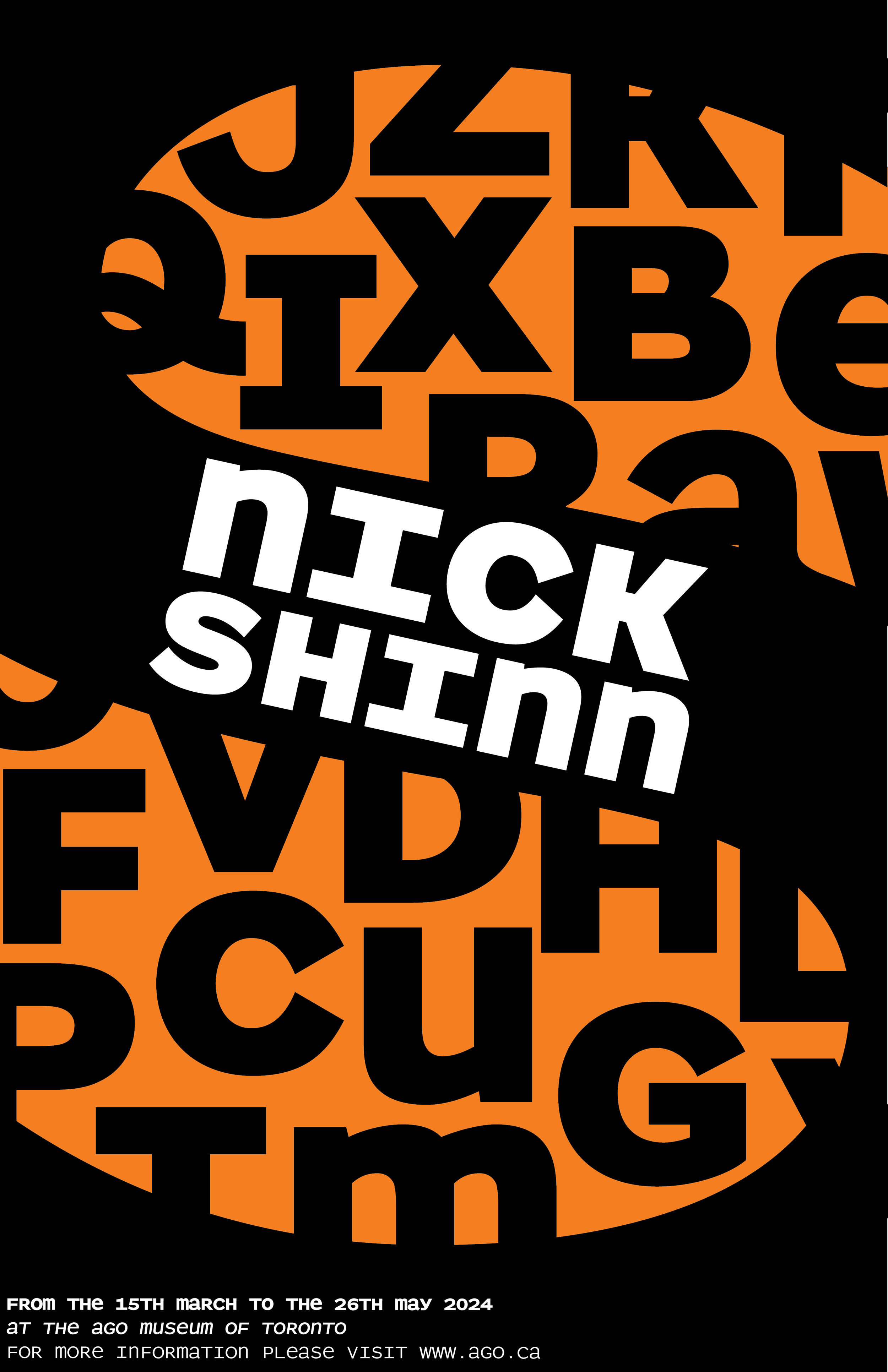
The first poster uses a 3D extrusion technique to bring the Aptly typeface to life. Words and groups of letters are extended outward, resembling buildings aligned along streets, a visual metaphor for the ubiquity of typefaces in the urban environment. This poster emphasizes the digital side of typography, an aspect that Nick Shinn has explored throughout his career. The use of bright colors ensures high visibility, while the contrast between black and white elements adds depth and clarity to the design.
Urban Typography
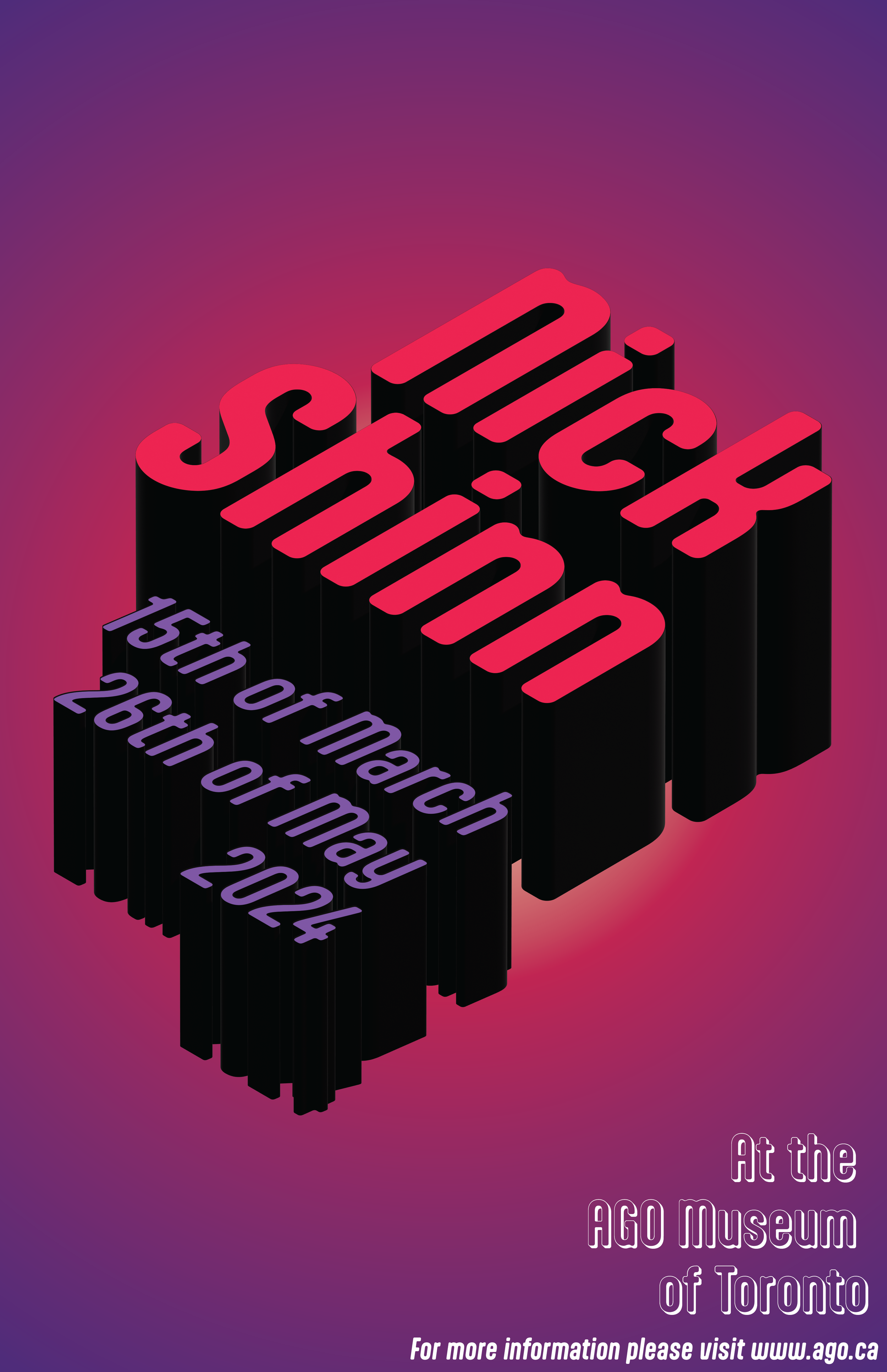
The second poster showcases the Parity Sans Mono typeface in Extra Bold, Medium, and Bold Italic. The capital letter "S" from Shinn's last name is enlarged to dominate the design, dividing the poster into several sections. The background is composed of letters from the same typeface, ensuring a cohesive and elegant look. This minimalist yet bold approach highlights the strong, geometric characteristics of Parity Sans Mono, drawing attention to the clean lines and modernity of the typeface.
Bold Simplicity