Identity Design for Pratt Norman
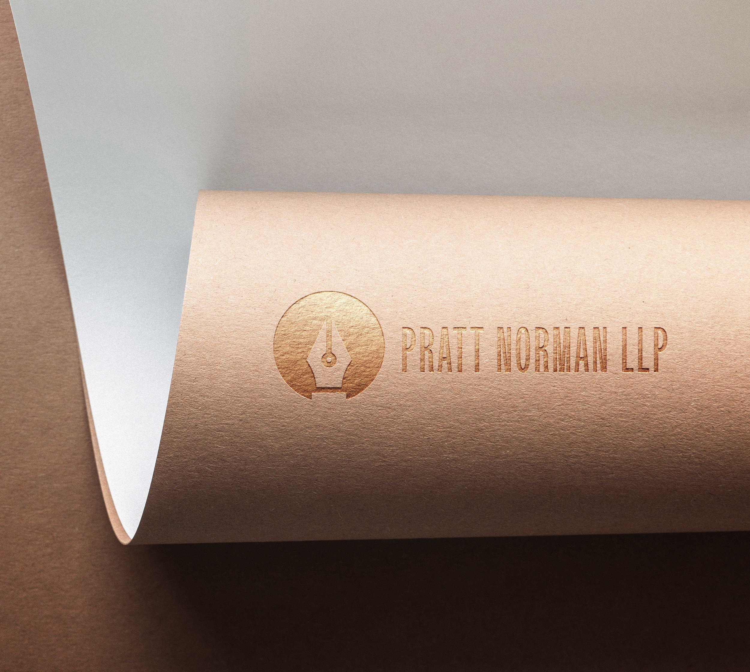
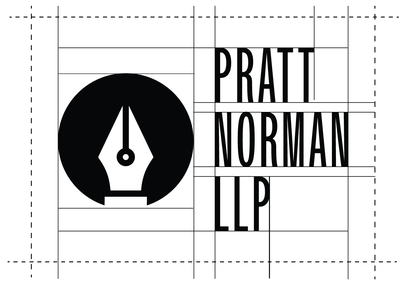
The logo is inspired by film production, going for a dramatic and fancy look. The logo is made of the wordmark (text) and the accompanying graphic :The icon of a pen is in reference to all the work that the audience often forget and that goes through behind the artwork such as intellectual property protection, endorsements, licensing and contracts agreements. The typeface chosen to represent the name of the firm is named Owners XXNarrow, a sans serif with medium mono weight stroke. The kerning has been lowered to create a more balanced logo.

Vintage Elegance
The color palette consists of a deep vintage red, black, white and gold. The red gives a vintage and legal look, the gold highlight allows for a more dramatic feel. Gold also represents wealth and luxury while black and white provides contrast for logo usage. While the gradient that creates the gold color can be used for any digital artwork, it is recommended to check with the printer for any printing artwork.


Stationery and Folder Design Specifications
For the stationery design, the brand identity is maintained while ensuring clarity. The horizontal logo is centered on the front of the name card, with the vertical wordmark on the back. The enlarged icon is placed opposite the text for balance. Text is differentiated by font weight: name in bold, title in regular, and contact details in italic, all using Basco Std Bold. The brand’s color palette is prominently featured. The pocket folder has a white interior with a colored icon pattern, a white logo section for contrast, and a brand-colored exterior with a thick white line for the full logo and company info. The letterhead uses a classic design with a vertical logo in the left corner, black lines separating contact and legal information, and is printed entirely in black for simplicity.


Dynamic Logo Animation
The sequence starts with the black circle appearing with the Smeak Effect, to remind of ink. The wordmark then appears from the left side of the screen followed by the fountain ink sliding in from the top and the bottom. The fountain ink icon elements all have the motion blur effect to make their actions more cohesive. The wordmark disappears with the Page turn effect, to mimic paper from contracts being turned, another nod the lawyer’s work. The black circle and icon of the fountain pen disappear by the reducing the size the of two shapes to 0.